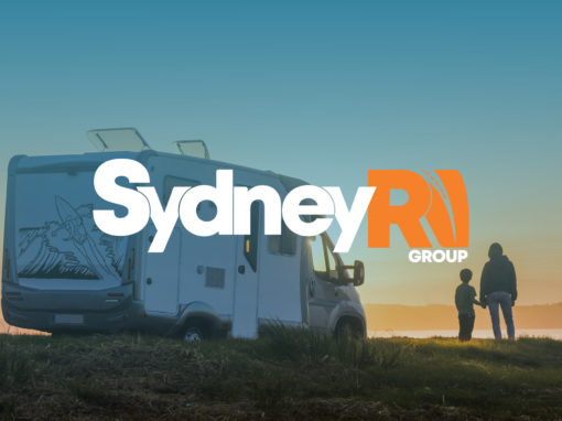
Sydney RV – Rebrand + Repositioning
The Challenge:
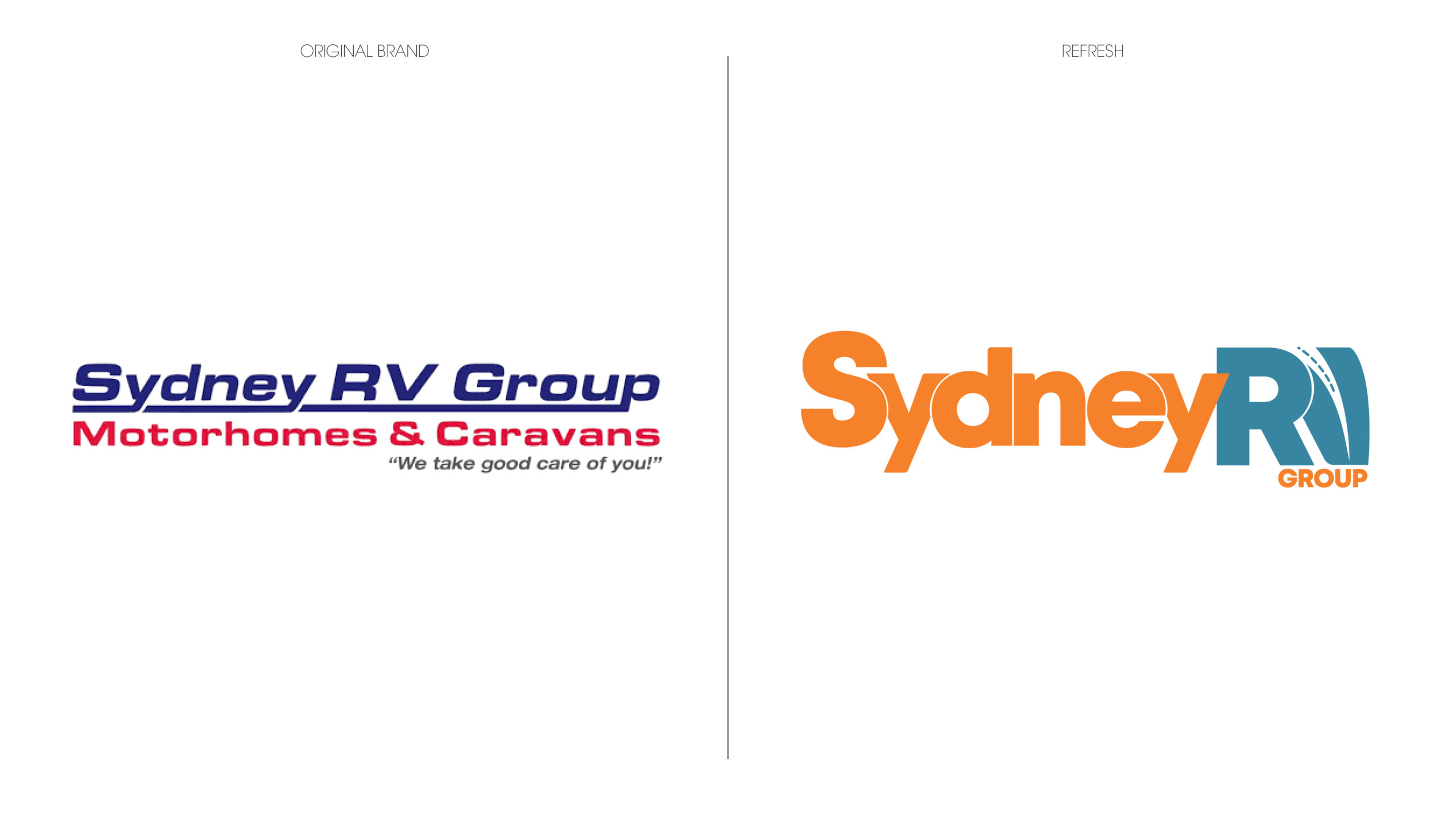
Sydney RV is one of the most prominent names in motorhomes and caravans in Sydney. With dated branding, they decided it was time to modernise their logo and reposition their brand. Enter ADFX.
The Solution:
The creative team at ADFX spent a lot of time analysing the existing brand as well as the broader RV market across NSW to help steer their new creative direction. Simplification was integral to the modernisation of their logo, with the team focusing on a reduction of words as well as a fresh colour palette to achieve a more streamlined brand solution.
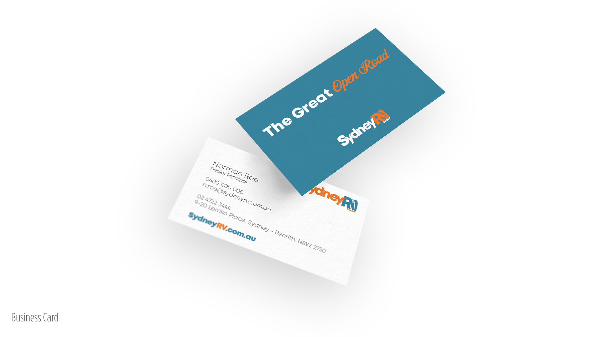
Another important consideration was the integration of elements from the overarching Apollo brand to ensure alignment. This was achieved through a combination of colours and elements (the Apollo orange brand colour being used prominently as well as a reinterpretation of the Apollo road symbol being utilised within the V of RV)
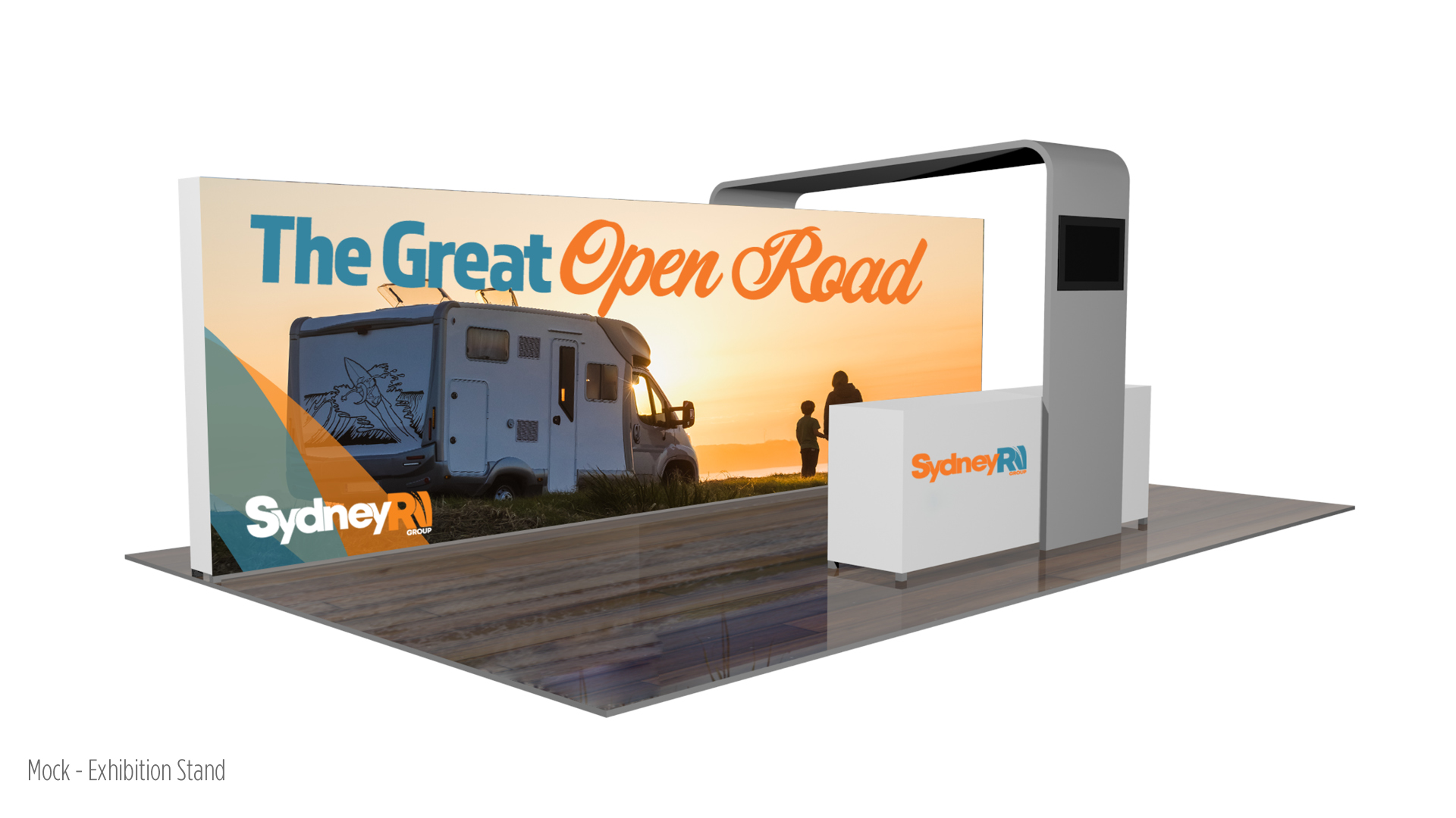
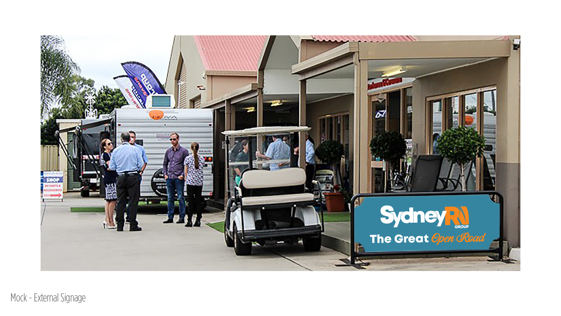
Check out the full case study below.
Project Details
Client Sydney RV
Services
Creative Direction
Brand Strategy
Graphic Design
Case Study


See more of our projects